Case study
ANEXT Design System 2.0

Overview
I unified fragmented design systems into a scalable system to reduce maintenance overhead, improve handoff efficiency, and scale designer adoption
Company
ANEXT Bank
Role
UX Designer
Responsibility
Led audit, consolidation, documentation, and governance of the design system
Duration
3 months (June 2025 – Sep 2025)
Adoption
+111%
Legacy usage
-58%
Background
Fragmented design systems across platforms created inconsistency and inefficiency
ANEXT product ecosystem spans online banking, mobile, and web applications.
Prior to this project, 2 separate design systems existed, one for online banking and one for mobile, each evolving independently and leading to inconsistencies.
I was tasked with consolidating them into a unified system to support all platforms.

Problem discovery
Conducted a design audit across inventory, usage, and communication to identify gaps
📦 Inventory
Reviewed design system files to catalog existing components and patterns.
🛠️ Usage
Analyzed project files against system components to find gaps and inconsistencies.
💬 Communication
Observed designer–developer handoffs and design reviews to identify challenges.
Problem definition
Audit revealed 5 key issues impacting consistency, efficiency, and product quality
Fragmented sources
Duplicated components existed across desktop and mobile design system files, leading to high maintenance overhead and inconsistent UI due to missed or partial updates.

Example: Button components are out of sync and vary across the design system
Lack of documentation
No clear documentation existed on usage, states, and behaviors. Designers applied components inconsistently and had to recreate documentation for each project, while developers required repeated clarifications.
Example: Common questions arose about avatar component behavior, such as how initials should be displayed for single names or Mandarin characters.

Lack of documentation in the design system; designers document components in project files
Missing patterns and templates
There was no dedicated section for reusable design patterns or templates. Designers created new solutions for problems already solved elsewhere, increasing engineering effort, slowing delivery, and forcing users to relearn patterns across product areas.
Lack of design system governance process
No structured contribution process existed. Most new components or variants stayed within local project files, leading to multiple inconsistent versions.
This resulted in fragmentation, as designers created new variants instead of improving existing ones.
Outdated UI
UI components did not reflect the intended product quality, reducing user trust and perceived credibility.

Objectives
Objectives defined to drive design system unification and scalability
🌀 Unify design system
Consolidate both systems into a single source of truth to reduce maintenance overhead, eliminate duplication, and ensure cross-platform consistency.
📝 Centralize documentation
Establish a centralized source for tokens, components, patterns, and templates to improve handoff efficiency and reduce repeated project-level documentation.
⚖️ Governance and adoption
Define clear contribution and review workflows to prevent fragmentation, and set adoption metrics to track usage and progress.
🌟 Visual uplift
Improve UI quality by leveraging an existing ANEXT design system, minimizing the need to recreate base components.
Solutions
Unify design system and visual uplift
To unify the design system, I organized the work into 2 phases:
Phase 1: Elements parity
Used another ANEXT product’s system as a base and integrated missing and necessary legacy elements from the existing desktop and mobile app design system.
Phase 2: Cleanup and consolidation
Refactored reusable project-specific components into the system and placed components that could not be integrated into a backlog for future standardization.
Components
I ensured that components were created with 3 key qualities in mind:
Configurable
Built with variants to support multiple use cases while maintaining a consistent structure

Scalable
Adapt across different viewports to ensure flexibility in responsive designs
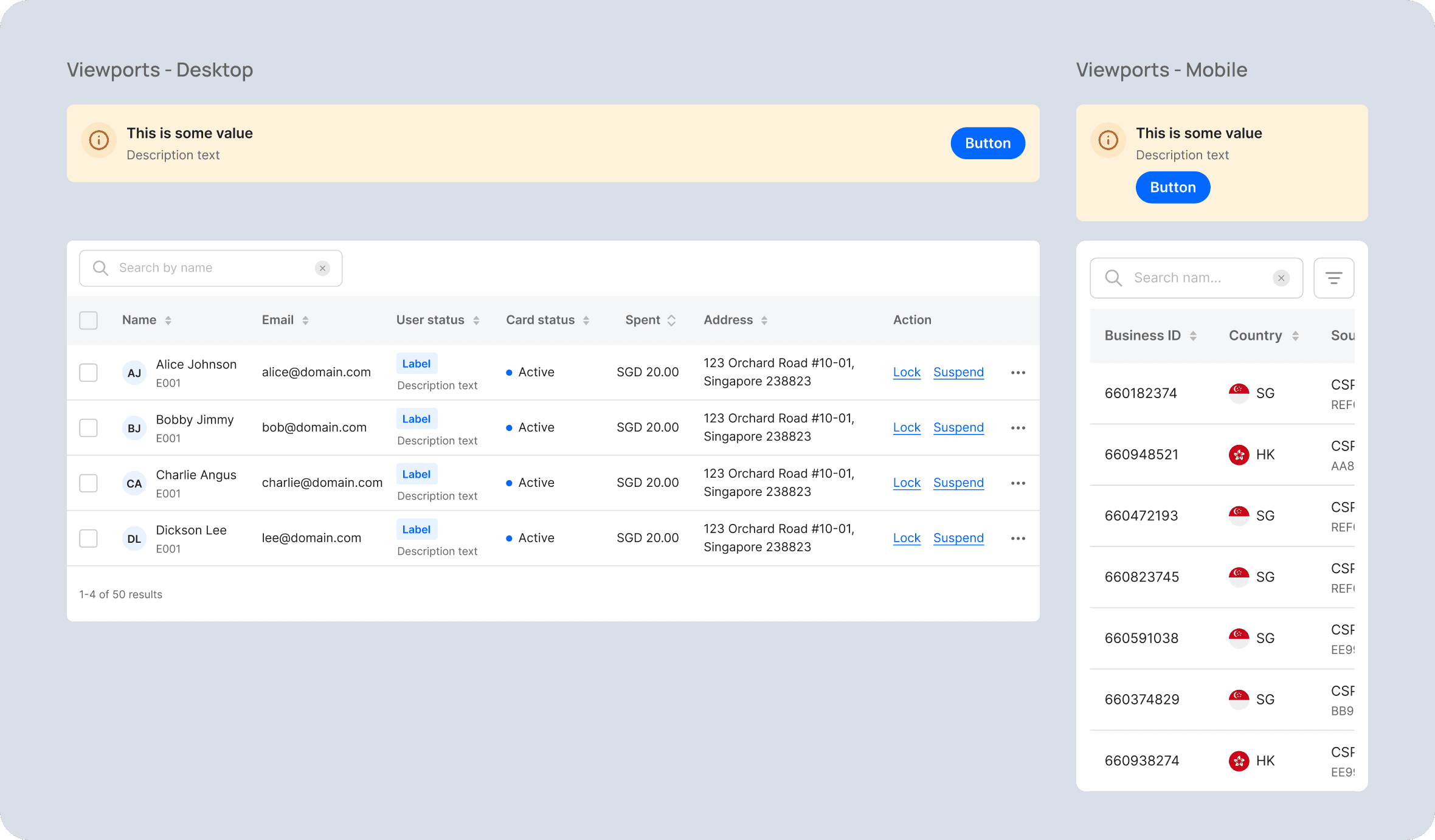
Interactive
Include interactivity for rapid prototyping, usability testing, design review, and developer handoff
Page templates
I consolidated existing page templates from desktop, mobile, and web-app platforms, and defined reusable master templates to standardize layout and behavior across platforms and viewports.
These templates can be copied into project files to quickly build pages.

Centralize documentation
Documentation structure
I defined a basic documentation structure to ensure that definitions and thinking processes are documented consistently and include all key specifications:

Tokens: Names, values, anatomy, usage

Components/Templates: Usage, anatomy, states, sizes, variants, interactions

Patterns: Usage, process flow, behavior
Onboarding guide
I also created onboarding guides for designers and developers to help new team members quickly get started with the design system. The guides include:
Overview of what the system is, who it’s for, and how it’s structured
Summary view showing available elements
Designer and developer-specific get started guides: Understanding available elements and using them in project file and accessing specifications via Figma Dev Mode

Governance and adoption
Governance model
For the governance model, we adopted a centralized approach, with designated design system owners (myself and another colleague) responsible for maintaining the system.
This approach allowed us to start governance quickly with a small number of decision makers, with the possibility to explore other models as the system matures.

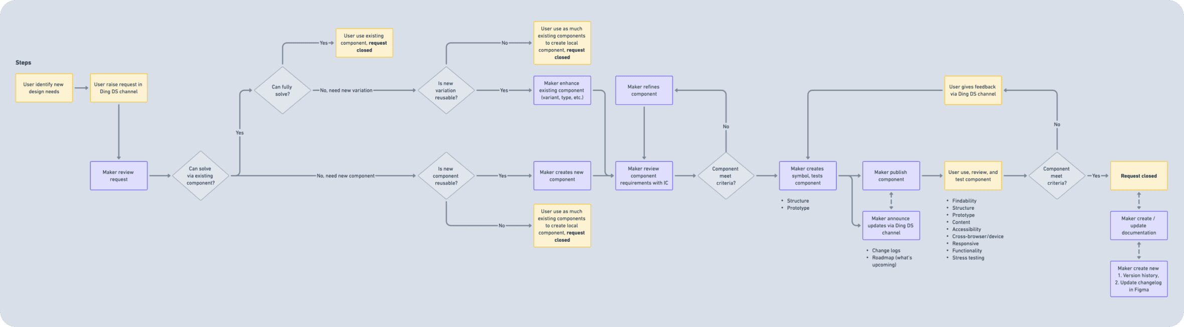
Contribution workflow
I defined a basic contribution workflow covering common scenarios, ensuring the team:
Uses existing components whenever possible
Contributes reusable components back to the system
Tracks components that cannot yet be integrated in a backlog
This helps maintain proper governance and ensures consistency and control.
Measurement framework
I created an adoption framework with metrics to track whether designers and developers are adopting and implementing the design system, specifically:
👩🏻🎨 Designer
Usage: Are designers using new design system components?
Adherence: Are designers following the guidelines or bypassing components?
Contributions: Are designers contributing back to the system?
👨🏻💻 Developer
Usage: Number of new components built
Coverage: Number of modules using new components
Engagement: Number of returning developers consulting the design system documentation
Launch and feedback
Once the design systems were unified, I published the design system for initial use and collected early feedback from designers and developers.

Outcome
Design system unification improved efficiency, consistency, and adoption
With the design systems now unified and fully documented, we observed several improvements:
📉 Maintenance overhead reduced
Consolidated 2 systems into a single source of truth, eliminating duplication, inconsistent tokens, and parallel maintenance efforts.
⚡ Handoff efficiency improved
Centralized documentation reduced repeated clarifications between designers and developers.
Following the launch, designer adoption also increased:
📈 Usage
New system usage grew by 111% (13,154 → 27,702), while legacy usage dropped by 58% (4,436 → 1,878) in Q4 2025.
☂️ Coverage
Components are now used across 4 key product modules.
🤝 Contributions
15 reusable components and 5 patterns were added to the system.
Next case study
Connect with me


Zhiyang
Copyright © 2026.