Case study
SeaBoard Back Office Redesign

Overview
I redesigned SeaBoard Back Office with role-based access to improve security, reduce risk, and support user growth
Company
SeaBoard Technologies
Role
Product designer
Responsibility
Information architecture, interaction design, visual design, design system
Impact
Enabled infrastructure to support 5× (400%) user growth
Background
SeaBoard as a crew wage platform
SeaBoard enables maritime organisations to disburse wages to seafarers via the Back Office and mobile app.
Here’s how it works:
Maritime organisations deposit funds into the Back Office (BO) account.
They disburse wages to seafarers.
Seafarers receive wages in the SeaBoard mobile app.

Challenges
Seaboard aimed to scale its user base but was constrained by security risks, financial liability, and limited team resources
To scale the user base by 5x, the existing single-access BO posed 3 challenges:
🔒 Security risk
Anyone with access could view sensitive financial data and funds.
🏦 Financial liability
SeaBoard disbursed wages on behalf of clients—any mis-transfer made the company responsible.
⚙️ Operational strain
As the user base grew, internal teams lacked resources to manually manage wage disbursement.
Goals
Enabling secure self-service through role-based access
We expanded the BO with role-based access so organisations could manage wage payments independently:
🛡️ Improve security
Only approved staff can access role-specific information and funds.
⬇️ Reduce risk
Shift disbursement responsibility to clients, lowering company liability.
⚙️ Increase operational efficiency
Free internal resources from managing disbursements.
Requirements analysis
Defining user roles
The BO will expand from a single login to support multiple role logins:
🧑✈️ Seafarers manager
Manages seafarers for the organisation.
👛 Wallet manager
Manages funds and wage disbursements.
💳️ Card manager
Distributes cards to seafarers.
Translating tasks into product features
The team mapped top tasks for each role into actionable product features.

Information architecture
Defining where and how each roles complete tasks
I established the site structure by determining the necessary pages for each feature. Each page defines:
Where users perform a step within a task flow.
How users navigate to the next step to complete their task.

Defining core models for each page to outline content, actions, and key UI components
This includes considering the page’s key communication—user and business goals, navigation flow, and page content and actions.
Understanding the content on each page helped me identify reusable templates and components for assembling the interface.

UI component design: Table example
Defining UI components methodologically
A methodological approach was used to define UI components, comprising:
Requirements definition: Identify component features and functions.
Exploration: Explore potential solutions and ideas.
Conceptualisation: Develop design concepts.
Testing: Validating designs through design critique, or user testing.
Refinement: Iterating and refining designs based on test results and new information.
Requirements definition
Taking the table component as an example, I defined its requirements by drawing insights from the sitemap and core model. Key considerations included:
🎯 What is the user trying to accomplish with the table?
Finding records based on specific criteria (e.g., keywords or parameters)
Taking actions on records (e.g., initiating a transfer)
💠 What are the essential components of the table required to support user actions?
Rows: Navigate up to 250,000 entries across 7 columns.
Table actions: Add, import, filter, sort, and export data.
Row actions: Open details and manage key actions.
Data display: Support strings, statuses, qualitative and quantitative numbers.
Exploration
I researched similar product UIs and design systems to generate design options for each smaller part, addressing specific problems like filtering and handling large datasets.
Conceptualisation
After collecting references, I created paper sketches to conceptually combine individual elements and form a cohesive table design.


Option 1

Option 2

Option 3
Testing
I drafted wireframes covering complex table scenarios and tested components with users to identify usability issues.

Refinement
Post-testing, I analysed feedback, identified major issues, and incorporated changes to improve the design:
#1: Hard-to-access filters
Filters are a common action, but the design required extra clicks. I exposed search filters for easier access.

Before

After
#2: Unclear table actions
Actions were scattered, making primary and secondary actions confusing. I separated primary and secondary actions, making main actions clear by putting them in their own column.

Before

After
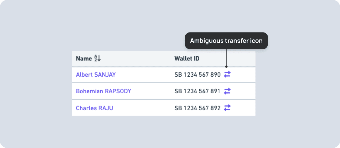
#3: Unclear icon communication
Some icons (e.g., transfer) were unclear without labels. I added hover labels and custom icons where necessary.
Before

After
#4: Relative date preference
Users preferred relative timestamps for immediacy to take decisive action. I updated tables to show relative dates.
Remaining component design
I applied the same iterative process to navigation systems and page templates, moving from abstract to detailed designs.
Back office design
Design functional and visually cohesive BO pages
Integrating content and components
With core templates and components defined, I drafted wireframes for each page, integrating content and components to ensure a functional and feasible design.

Applying visual design to templates
I added a visual design layer to templates and components, creating mock-ups for key pages to ensure cohesive UI design and provide a reference point for developers.

Auth template

List template

Details template

Process template
Documentation and handover
As part of the handover, I walked developers through the design and documented specifications for the UI framework and pages.

Impact
Potential 5× (400%) user growth
Redesign enabled infrastructure to support 400% user growth by eliminating single-access security risks.
Next case study

Connect with me


Zhiyang
Copyright © 2026.